After months of testing, experimenting and running a wide variety of metallic ink print jobs, we’ve noticed certain types of designs and color choices work better than others. The following are some tips and tricks we’ve learned along the way so that you can get the best results possible on your next metallic ink project.
Tip #1 – Consider print technique and limitations early in the design process
Reading this article is a good place to start. It’s better to know what types of designs and color builds to avoid and what works best early on so you can design with these things in mind. If you have an idea and are concerned about how it might turn out, reach out…we are happy to help and consult (and there is always the option to run a concept proof just in case).
Tip #2 – Silver Ink + CMYK = Metallic Color
When deciding what color builds to use, it is important to understand the metallic ink process.
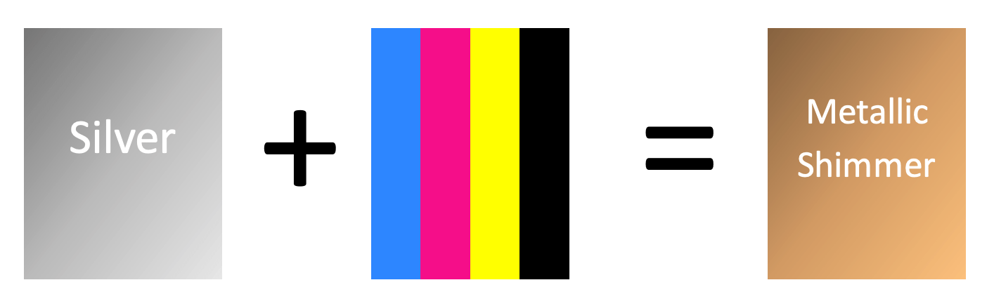
Why is this important? Metallic ink is silver. Printing CMYK on top of metallic ink will shift the appearance of the color.
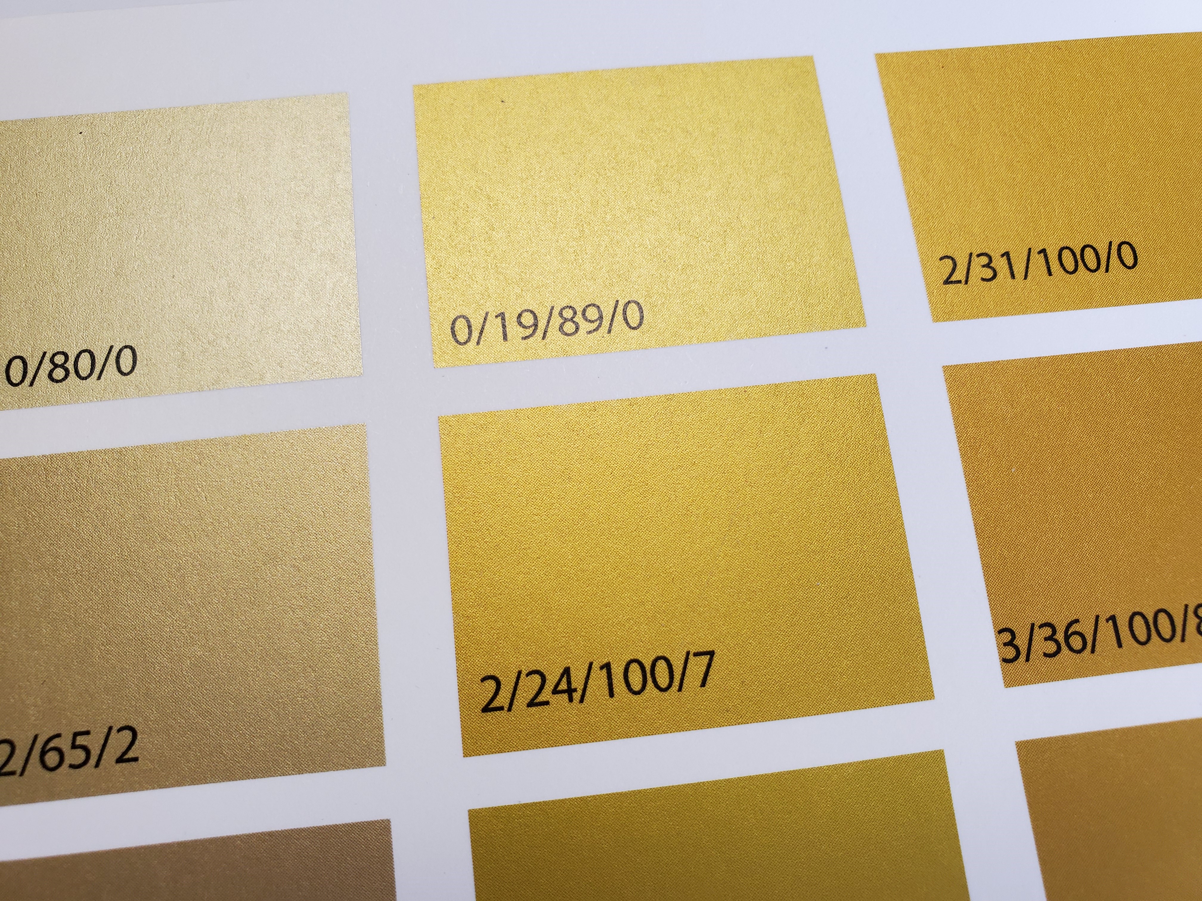
We recommend using lighter color builds for optimal shimmer. This is because darker cmyk builds are more opaque and the metallic ink will not show through.
We are not able to color match metallic ink. If you are trying to achieve a specific color we suggest creating a color swatch that we can print to ensure you are happy with the resulting color.
Tip #3 – Coated vs Uncoated Papers will Produce two different metallic effects.
Because the process involves ink only (rather than literal metal foil), the texture of the paper will have an effect on both color and the texture of the ink coverage.
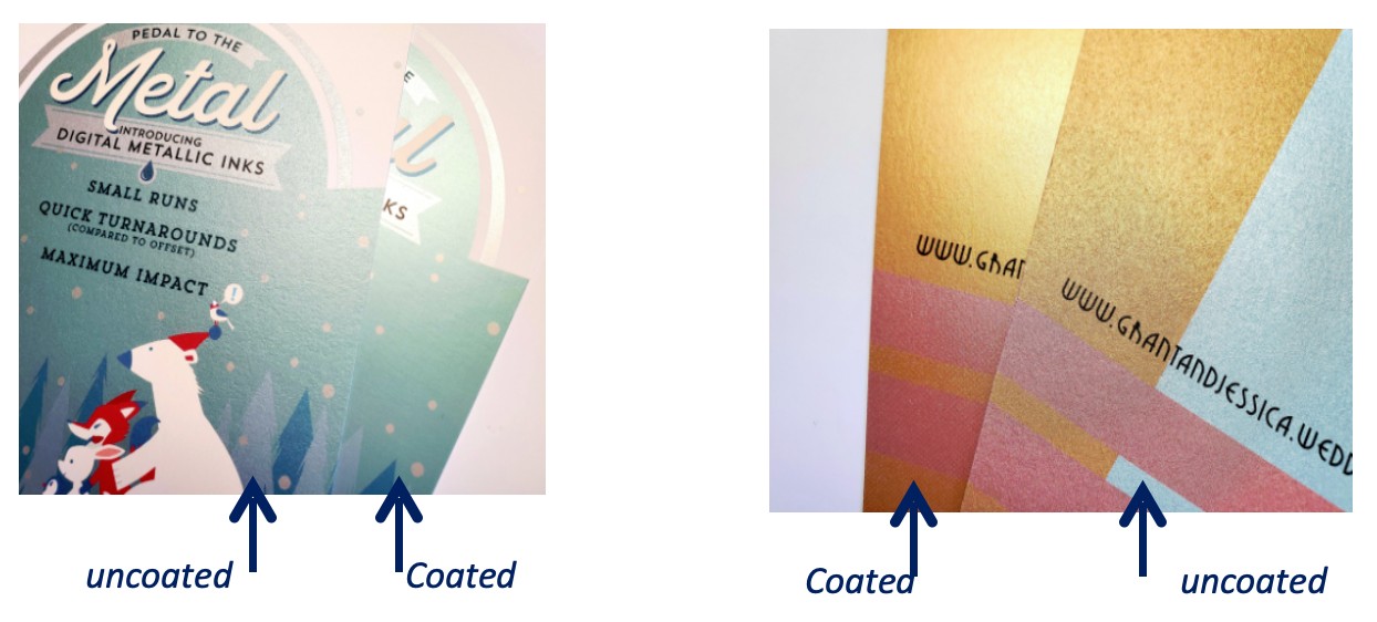
For coated papers, such as Blazer Gloss or Silk, the metallic ink has a smooth and shiny look, similar to matte foil.
For uncoated papers, such as Mohawk Everyday Digital or Superfine Eggshell, the metallic ink has an almost sparkly look that emphasizes the texture of the paper. To make metallic ink work on uncoated paper white ink needs to be printed under the metallic ink. See FAQ for file set up.
Tip #4 – Full Flood vs Spot will produce different effects
While metallic ink can be used in various different ways, either as a full flood or as a spot, it is helpful to have an idea of what the effect is going to look like. We have found that the metallic ink stands out the most when used with low ink coverage on the paper.

It also stands out when used as a contrast within a full flood/heavy ink coverage design.
However, we do recommend the metallic color be a light color build.
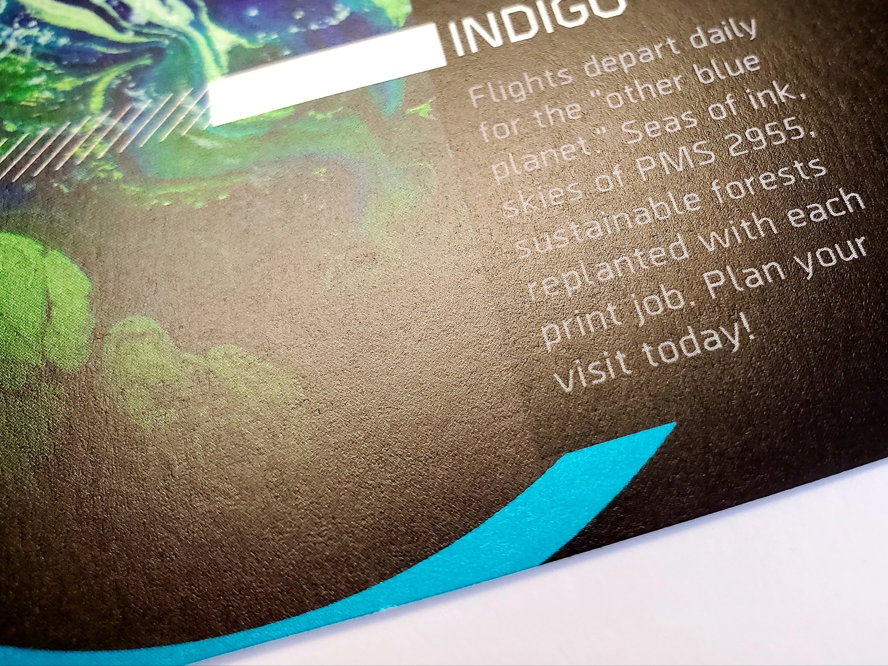
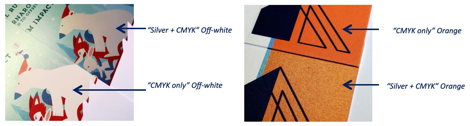
This is a picture of Silver+CMYK “Metallic Blue” against CMYK only Black. As you can see, the “metallic look” doesn’t show up very well. In this example, it is a combination of a dark blue color build and the inherent glossiness of the ink on full flood rich color builds that takes away from the metallic contrast.
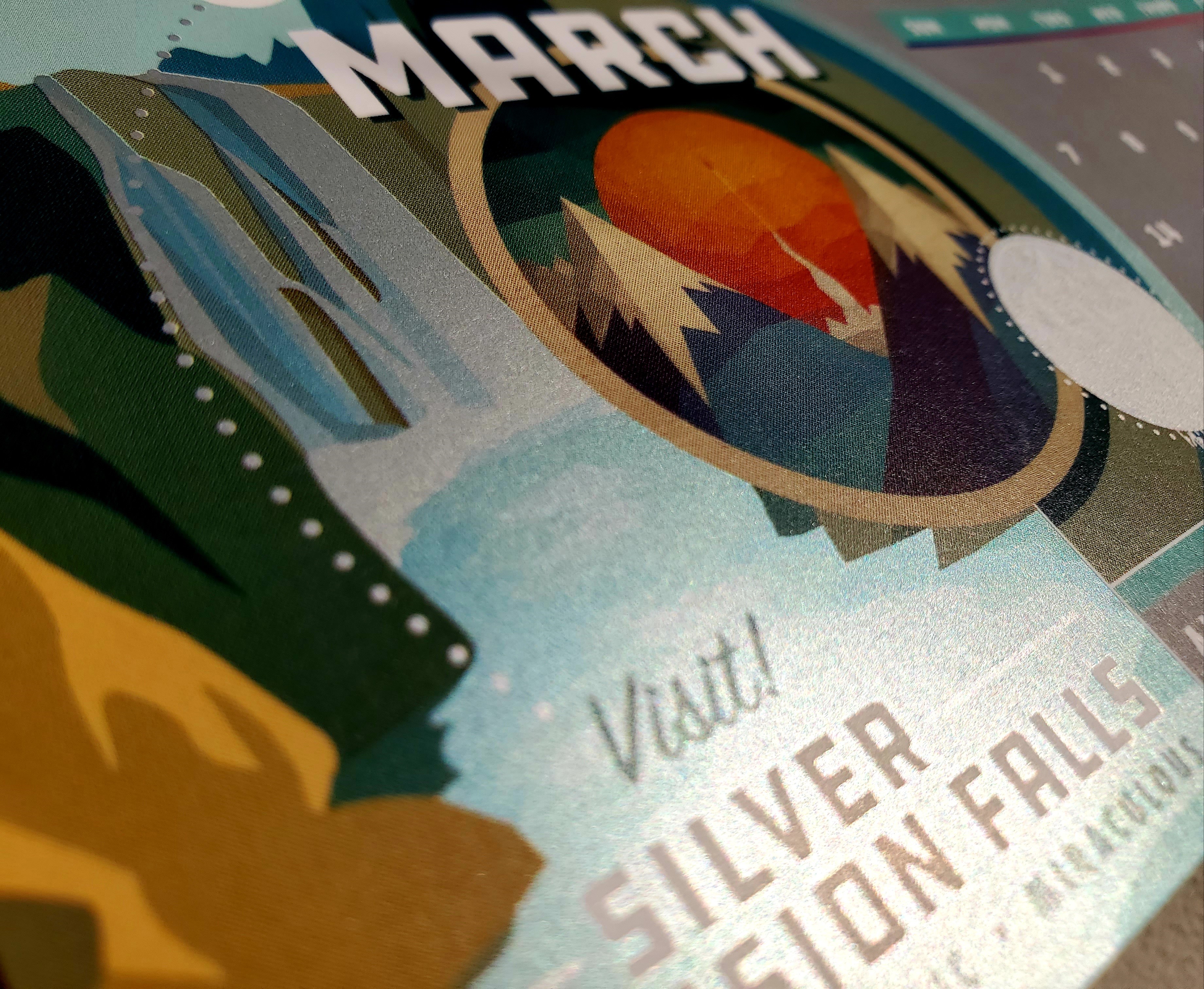
Metallic Ink also works as a full flood, giving the appearance that the piece was printed on metallic paper.
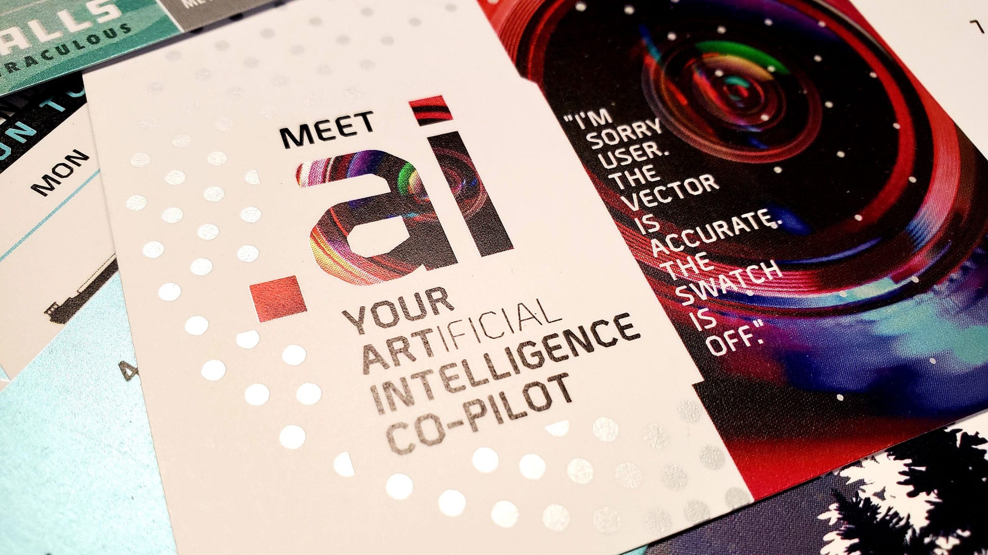
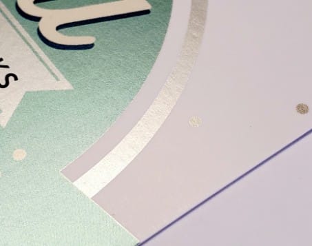
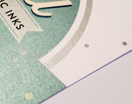
Tip #5 – Metallic ink can be used as a silver ink spot color.
The sample below shows silver ink without any cmyk on top.
Tip #6 – Avoid fine lines and thin script text.
Metallic ink shows best as a larger print element and bolder, larger text. It is not as noticeable on thin lines or light text.
We hope this provides some useful guidance and design inspiration for your next print design project. For technical instructions on how to set your file up for metallic ink, please visit our resources page.